Dicas

Carregando, aguarde alguns segundos.
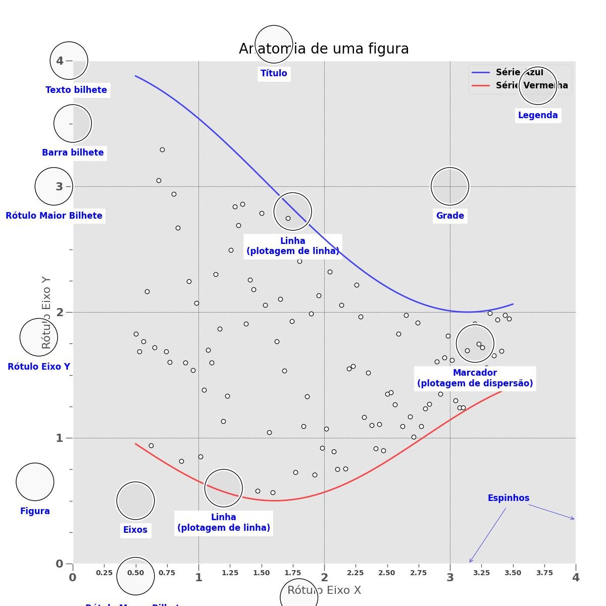
1 - DICA CIEDA #001 Diagrama do Gráfico
O gráfico abaixo tem 3 séries, duas com plotagem de linhas e uma com plotagem de dispersão, feitos com valores aleatórios, sendo construindo incluindo comentários sobre os elementos presentes no gráfico.
Os comentários são construidos com circunferências e textos usando as funções circulo() e texto().
O próprio processo de inclusão de comentários no gráfico demonstra a variedade de recursos disponíveis para sua construção.
Analise o código observando o gráfico produzido, e rode no interpretador do Python ou no Jupyter-Lab.
import numpy as np
import matplotlib.pyplot as plt
from matplotlib.ticker import AutoMinorLocator, MultipleLocator, FuncFormatter

np.random.seed(19680801)

X = np.linspace(0.5, 3.5, 100)
Y1 = 3+np.cos(X)
Y2 = 1+np.cos(1+X/0.75)/2
Y3 = np.random.uniform(Y1, Y2, len(X))

plt.close()

fig = plt.figure(figsize=(12, 12))
ax = fig.add_subplot(1, 1, 1, aspect=1)

def menor_bilhete(x, pos):
    if not x % 1.0:
        return ""
    return "%.2f" % x

ax.xaxis.set_major_locator(MultipleLocator(1.000))
ax.xaxis.set_minor_locator(AutoMinorLocator(4))
ax.yaxis.set_major_locator(MultipleLocator(1.000))
ax.yaxis.set_minor_locator(AutoMinorLocator(4))
ax.xaxis.set_minor_formatter(FuncFormatter(menor_bilhete))

ax.set_xlim(0, 4)
ax.set_ylim(0, 4)

ax.tick_params(which='major', width=1.0)
ax.tick_params(which='major', length=10)
ax.tick_params(which='minor', width=1.0, labelsize=10)
ax.tick_params(which='minor', length=5, labelsize=10, labelcolor='0.25')

ax.grid(linestyle="--", linewidth=0.5, color='.25', zorder=-10)

ax.plot(X, Y1, c=(0.25, 0.25, 1.00), lw=2, label="Série Azul", zorder=10)
ax.plot(X, Y2, c=(1.00, 0.25, 0.25), lw=2, label="Série Vermelha")
ax.plot(X, Y3, linewidth=0,
    marker='o', markerfacecolor='w', markeredgecolor='k')

ax.set_title("Anatomia de uma figura", fontsize=20, verticalalignment='bottom')
ax.set_xlabel("Rótulo Eixo X")
ax.set_ylabel("Rótulo Eixo Y")

ax.legend(loc="upper right")

def circulo(x, y, raio=0.15):
    from matplotlib.patches import Circle
    from matplotlib.patheffects import withStroke
    circulo = Circle((x, y), raio, clip_on=False, zorder=10, linewidth=1,
                    edgecolor='black', facecolor=(0, 0, 0, .0125),
                    path_effects=[withStroke(linewidth=5, foreground='w')])
    global ax
    ax.add_artist(circulo)

def texto(x, y, texto):
    global ax
    ax.text(x, y, texto, backgroundcolor="white",
            ha='center', va='top', weight='bold', color='blue')

# Rótulo Menor Bilhete
circulo(0.50, -0.10)
texto(0.50, -0.32, "Rótulo Menor Bilhete")

# Maior bilhete
circulo(-0.03, 4.00)
texto(0.03, 3.80, "Texto bilhete")

# Menor bilhete
circulo(0.00, 3.50)
texto(0.00, 3.30, "Barra bilhete")

# Rótulo Maior Bilhete
circulo(-0.15, 3.00)
texto(-0.15, 2.80, "Rótulo Maior Bilhete")

# Rótulo Eixo X
circulo(1.80, -0.27)
texto(1.80, -0.45, "Rótulo Eixo X")

# Rótulo Eixo Y
circulo(-0.27, 1.80)
texto(-0.27, 1.6, "Rótulo Eixo Y")

# Título
circulo(1.60, 4.13)
texto(1.60, 3.93, "Título")

# Plotagem da linha azul
circulo(1.75, 2.80)
texto(1.75, 2.60, "Linha\n(plotagem de linha)")

# Plotagem da linha vermelha
circulo(1.20, 0.60)
texto(1.20, 0.40, "Linha\n(plotagem de linha)")

# Plotagem de dispersão
circulo(3.20, 1.75)
texto(3.20, 1.55, "Marcador\n(plotagem de dispersão)")

# Grade
circulo(3.00, 3.00)
texto(3.00, 2.80, "Grade")

# Legenda
circulo(3.70, 3.80)
texto(3.70, 3.60, "Legenda")

# Eixos
circulo(0.5, 0.5)
texto(0.5, 0.3, "Eixos")

# Figura
circulo(-0.3, 0.65)
texto(-0.3, 0.45, "Figura")

color = 'blue'

ax.annotate('Espinhos', xy=(4.0, 0.35), xycoords='data',
            xytext=(3.3, 0.5), textcoords='data',
            weight='bold', color=color,
            arrowprops=dict(arrowstyle='->',
                            connectionstyle="arc3",
                            color=color))

ax.annotate('', xy=(3.15, 0.0), xycoords='data',
            xytext=(3.45, 0.45), textcoords='data',
            weight='bold', color=color,
            arrowprops=dict(arrowstyle='->',
                            connectionstyle="arc3",
                            color=color))

ax.text(4.0, -0.4, "Feito com http://matplotlib.org",
        fontsize=10, ha="right", color='.5')

plt.show()

Arduino
Coautor

Betobyte
Autor
Autores